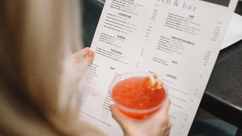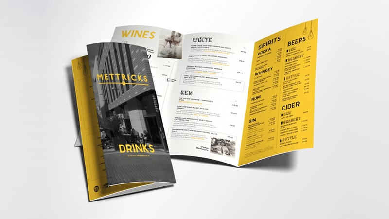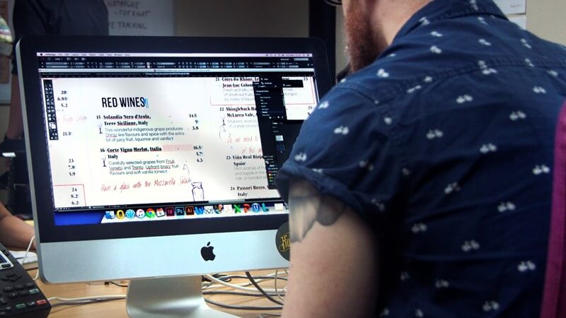
Your drinks menu is your best tool to communicate your drinks range. It needs to be visible and quickly and easily accessible. It has to pull its weight too, helping you sell more. A great menu is, at its core, a tool for maximising your profits; encouraging the consumer to purchase the most profitable drinks.
But how do you make your menu great? We think this is where Menu Engineering comes in. In our studies, it's been shown to increase profits. It's a deliberate and strategic design code that our team applies to lists. There are four main drivers behind the concept you can use on any drinks list.
The psychology of menu design
This first driver, psychology, involves consumer perception, capturing the buyer's attention and emotion. There are a couple of conscious and unconscious tricks that our mind plays when browsing a menu, tricks of the brain that can be used to encourage extra sales.
1. Use a decoy
Savvy operators make the first item in any section of a menu the most expensive. This product is called a decoy and makes the other items on the list to all look reasonably priced. Once a customer has accepted that they may have to spend more than they imagined they become more open to ordering a premium product.
2. Group together
With wine especially, moving up a drinks list comes with some perceived risk. What if you spend £20 more but end up with a wine you don't like? It's a bit late once a bottle is opened. Customers can, therefore, stick to known 'international varieties', think New Zealand Sauvignon Blanc or a typical Rioja wine. Menus can reassure guests by grouping wines into styles. When customers see a particular wine grouped with a wine they enjoy, they are more likely to give that wine a chance.
3. Ditch country organisation
Research by the late Gérard Basset MW found customers want lists arranged by either type, taste or by food matching and felt that a list laid out geographically 'indicated that the restaurant knew the least about wine'. Reorganising your list and individual groupings, so neither price or country lead will instil some trust in your range.
4. Box up
Our eyes are quickly drawn astray. The easiest way is by adding a box around the products you want to highlight. These products should be your more profitable products, including any decoys. Even this subtle detail can make a product seem more appealing, "it must be special to be highlighted". Combined with a decoy, this is a powerful way to guide purchasing decisions.
Marketing principles of menu design
Now we come to the art of persuasion. There are a few things to consider when asking how you can make the products you want to sell more appealing.

5. Make it personal
People trust people. Products become more appealing when bespoke personal messages are used. For example, adding "our Chef recommends this with our steak" or "staff favourite" to your menu. It reinforces the idea that the venue, and it's staff, believe in the quality of the products they are selling.
6. Be descriptive
The use of descriptive words to enhance the perception of a product is nothing new. In the food and drink industry, businesses rush to words that evoke indulgence. Think of words like smooth, hearty, fruity, creamy, fresh and velvety. These adjectives can be a little vague, but there is sometimes a benefit in this too, with experimental customers often keen to order and find out more.
7. Recognise quality
Include awards and techniques to let the consumer know a product is well-recognised and produced with care. Call 'an award-winning hand-made organic wine' precisely what it is. Prioritise quality too, lead with Champagne not Prosecco and save the back page for bottled water, fruit juice and post-mix.
Using graphic design
The design of the menu is crucial to giving the right impression. Getting the appearance and design right is essential for the list to compliment your outlet.
8. Be consistent
Ensure that all menus from the outlet look visually the same and look part of a set. Your menus should reflect the quality of your service and offer; this means ensuring time is spent on getting it looking nice and using a good quality paper and finish. Of course, there is no need to spend big on menu design and print. For example, you can give off a rustic character with a simple one-sided list attached to a clipboard provided it is consistent with what the impression you want to give.
9. Cross promote
Menus are useful tools beyond displaying your product range. Include details of your social media channels so that the outlet can keep in contact with the consumer and use extra space to shout about events, i.e. 'Fizz Fridays' and any other forms of income.

Menu pricing best practice
We haven't mentioned the price yet for a good reason. The bill is the last thing the customer should be thinking about; the customer should have already decided on what they want to drink before checking the cost.
10. Don't hide prices
Don't highlight the price, but don't hide it either! Use techniques to draw attention elsewhere. Aligning your list centrally, so that prices are beneath descriptions, can achieve this. When centrally aligned, prices remain visible but are not quickly compared.
11. Remove pound signs
Research has shown that consumers are more likely to spend more when pound signs are removed. It is thought that only showing a number somewhat disconnects the price and the perceived cost to the consumer. Only showing prices as a single number, i.e. 6 rather than 6.00, is thought to have a similar effect.
12. Use progressive pricing
Consider using a progressive pricing approach to wine to 'level out' pricing across your range. Progressive pricing is where you add a percentage gross profit margin to wines at the bottom of your list and a cash profit margin to wines further up your pricing ladder. Using an approach such as this means the prices of your wines are closer together and encourages people to purchase wine at a higher price - closer to their price ceiling.

